Conversion · 9 min read
Why Is My Website Not Converting? 10 Reasons to Fix Now
Low conversion rates are rarely one problem. They're usually several small ones compounding against each other.
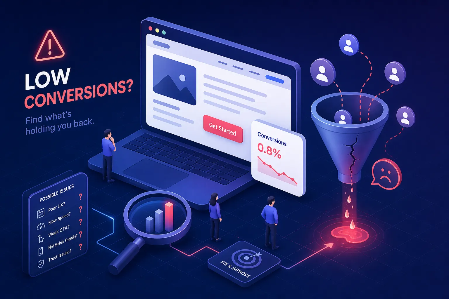
If you're asking why your website is not converting visitors into real inquiries, you're not alone. Traffic without contact form submissions or phone calls is one of the most frustrating gaps a business owner can face, and it almost never has a single cause hiding behind it.
Low conversion rates are usually the result of several small problems compounding against each other: a headline that doesn't land, a button nobody notices, a page that loads too slowly on a phone, and a form that asks for too much before giving anything back. Any one of those issues alone might cost you a few inquiries. Together, they can make a site feel completely dead despite steady traffic.
What follows is the same diagnostic framework Better Website Co. uses before touching a single element of a client's site. Work through these 10 conversion killers, identify the ones that apply to your site, and you'll have a prioritized list of fixes that can meaningfully move your inquiry numbers.
1. When Your Headline Confuses Instead of Converts
A conversion-ready headline tells a specific visitor exactly what they'll get and why it matters to them. Most business websites get this backwards, leading with their own story: "We are a full-service agency with 15 years of experience." That sentence is about you, not the person reading it. This is one of the top low conversion rate causes across nearly every site type.
The formula that works is outcome plus audience: who you help, and what they walk away with. "We help Dallas homeowners stop paying for repairs that never stick" beats "Full-Service HVAC Solutions" because it speaks to a real frustration the visitor already has.
2. A Value Proposition That Doesn't Answer "Why You?"
Even when visitors understand what you do, they often can't figure out why they should choose you over anyone else. Try this self-test: remove your logo and swap your homepage copy onto a competitor's site. If the words still make sense, your messaging isn't doing its job.
Your value proposition should be specific enough that a competitor couldn't honestly claim the same thing. "Trusted by homeowners across Austin since 2009" is stronger than "Quality work at fair prices."
3–4. Your Calls-to-Action Aren't Asking for Anything
"Submit," "Learn More," and "Click Here" tell visitors nothing about what happens next. Specific, expectation-setting copy reduces hesitation at the exact moment someone is deciding whether to take action. "Get My Free Estimate" beats "Submit" every time. In practice, specific benefit-led button copy routinely outperforms generic labels by 30% or more in click-through rate tests.
Placement is as important as the words. If a visitor has to scroll before they see what to do next, most of them won't scroll. Your primary CTA needs to be visible above the fold on both desktop and mobile, and it needs to be the highest-contrast element on the page.
5–6. Slow Load Times and a Broken Mobile Experience
A one-second increase in load time can reduce conversions by approximately 7% on average, a benchmark reported consistently across industry performance studies. Google PageSpeed Insights is free, takes two minutes to run, and gives you a specific list of what to fix. Start there.
Desktop conversion rates average around 3.2% to 4.3% across most industries. Mobile often lags at 1.8% to 2.8%, and the gap is almost entirely explained by friction: tap targets that are too small to hit accurately, text that requires pinching to read, CTAs pushed below the fold, and contact forms that are painful to complete on a touchscreen.
7–8. There's Nothing on Your Site That Builds Trust
Trust signals are the evidence a visitor needs to believe that working with you is a safe choice: client testimonials with real names and specific outcomes, Google review ratings, industry certifications, clear contact details, and press mentions if you have them.
Presence matters, but placement matters just as much. Testimonials buried on an About page do significantly less work than a short, specific quote placed directly above your contact form. The most effective setup near a contact form combines a one-line reassurance about next steps, a short testimonial with a real name, a visible phone number or email option, and a promise about response time.
9–10. Friction Is Making the Simplest Action Feel Complicated
When a visitor faces too many clickable options at once, they often click on nothing. A well-converting page has one primary action it wants visitors to take, and every other element on the page supports that action rather than competing with it. Simplifying navigation on service pages and landing pages is often one of the highest-impact structural changes a business can make.
Reducing a lead form from 11 fields to 4 can lift completion rates by 30% to 50%. Every unnecessary field is a question a visitor has to answer before they get anything in return. Ask only for what you absolutely need to take the next step with a prospect.
How to Run a Quick Conversion Audit
Three free tools cover the core of a quick site conversion audit. Google Analytics 4 shows you where visitors drop off in the funnel. Microsoft Clarity, also free, gives you heatmaps and session recordings so you can watch what people actually do before they leave. Google PageSpeed Insights shows you the technical performance problems slowing the experience down.
The workflow is straightforward: find where people leave, watch what they do before they leave, and fix the page causing the biggest drop-off first.
The Real Answer
It's rarely one thing. It's usually weak messaging working against a vague CTA, compounded by slow load times on mobile, with no trust signals anywhere near the contact form, and a form that asks for too much before delivering anything. Each problem alone costs you a few inquiries. Together, they can make a site nearly invisible as a lead source despite consistent traffic. The good news is that fixing even three of these issues produces a measurable improvement. You don't need a full redesign to move the needle.
Want this thinking applied to your business?
A free strategy call costs nothing and tells you exactly where you stand.