Conversion · 7 min read
Website Lead Generation: Turn Traffic Into Real Inquiries
Visitors showing up is only half the equation. Getting them to reach out is the other half, and most sites never build for it.
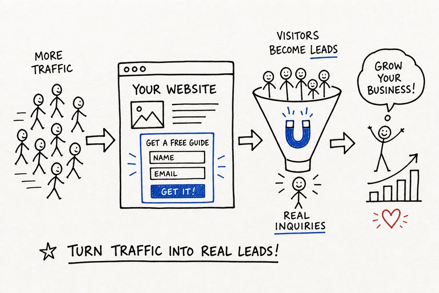
You built a website. Maybe you even get a decent number of visitors each month. But the phone doesn't ring, the inbox is empty, and you're left wondering what went wrong. The hard truth: website lead generation doesn't happen automatically just because you have traffic. Visitors showing up is only half the equation, getting them to reach out is the other half.
The problem usually isn't your traffic. Many small business websites prioritize aesthetics over conversion-focused design. Decisions get made based on what the owner likes, not on what makes a visitor say "yes, I want to contact these people." There's no clear path from "I just landed on this page" to "I'm ready to reach out." Lead capture strategies get treated as an afterthought, a contact form dropped into the navigation at the last minute, and that's considered "good enough." It's not.
This article walks you through the four areas that make the biggest difference: your calls to action, lead magnets, contact forms, and landing pages. Get these right, and your website starts working for you around the clock.
Why Your Website Isn't Generating Leads
Think about walking into a store with no staff, no signs, and no visible checkout counter. You'd turn around and walk right back out. A website without clear direction does exactly the same thing. Visitors don't know what to do next, so they leave.
Lead capture needs to be designed into the structure of your site from the very beginning, not patched in after the fact. That's the difference between a site that looks like a business and one that actually runs like one. At Better Website Co., this is the first conversation we have before any design work starts: what do we want visitors to do, and how does every page support that goal?
Website Lead Generation Starts With CTAs and Hero Sections
Your call to action is the most important button on your website. Many sites still rely on generic labels like "Submit" or "Contact Us," which tell the visitor nothing about what they'll get. Replace that copy with language that's specific and benefit-led. "Get my free quote," "Book a 15-minute call," and "See how it works" all outperform vague defaults because they tell the visitor exactly what happens next.
Placement matters just as much as the words you use. Your primary CTA should appear above the fold, meaning the visitor sees it without scrolling at all. If someone has to hunt for a way to contact you, most of them won't bother. Consider grouping your CTA with a short trust signal right below it: a client count, a star rating, or a one-line testimonial can be the nudge that turns a hesitant visitor into an inquiry.
Your hero section, the top of your homepage, is your most valuable real estate. It should answer three questions in the first few seconds: who you help, what you do for them, and what they should do next. Pair a clear headline with one CTA and one trust signal: a client count, a testimonial snippet, or a logo visitors recognize. That combination builds confidence fast and gives visitors a reason to act.
Lead Magnets: Give Visitors a Reason to Say Yes
A lead magnet is something valuable you offer in exchange for a visitor's contact information. For service businesses, the most effective lead magnets are checklists, free consultations, or short assessments, they deliver real value without asking for a big time commitment. A quiz like "Is your website losing customers?" or a checklist like "5 things your website needs before you run ads" will consistently outperform a vague "free guide" because it speaks to a problem the visitor already has.
Not every visitor is ready to book a call the first time they land on your site. Some are still in research mode, comparing options. A well-placed lead magnet captures those visitors before they leave, giving you a chance to follow up by email and build trust over time. Keep the exchange simple: name and email in return for something genuinely useful.
Contact Forms: Shorter Is Almost Always Better
Shorter forms convert better, that's one of the most consistent findings in website conversion optimization (CRO). For most small business websites, your contact or inquiry form needs just three fields at most: name, email, and one qualifying question like "What do you need help with?" Every extra field you add is another reason for someone to stop and abandon the form. Ask yourself: do I actually need this information to have a useful first conversation? If the answer is no, cut the field.
A few small details make a real difference in form completion. Use a single-column layout so the form scans easily on a phone. Label your fields clearly and place them above the submit button, not beside it. Add a short trust note near the button: "We'll get back to you within one business day" or "No spam, ever." These small reassurances reduce hesitation right at the moment someone is about to click. To put numbers behind it: in one client project we worked on, trimming a form from 11 fields down to 4 more than doubled the completion rate, a result consistent with what conversion specialists see regularly when streamlining web lead capture forms.
Landing Pages: One Goal, One Page, One Action
A landing page has one job: get the visitor to take a single action. No navigation menu pulling them elsewhere, no unrelated content competing for attention. Just the offer, the proof, and the form. For small businesses, a focused landing page built around landing page optimization best practices, matched to a specific service or offer, will frequently outperform sending traffic to the homepage, because the homepage tries to do too many things at once.
Every high-converting landing page follows the same basic structure. Start with a headline that matches what the visitor was promised before they clicked, whether that was an ad, a social post, or a link. Follow it with a short description of the offer, two or three trust signals like testimonials or results, and one CTA repeated at both the top and bottom of the page. Keep the copy tight, keep the design clean, and make sure the page loads fast. A focused page with one clear ask will frequently outperform a beautiful but cluttered one.
Start With What You Have, Then Build From There
Getting more leads from your website isn't about adding a contact form and hoping for the best. It's about building every element with intention, so visitors always know what to do next and feel confident enough to do it. When lead capture is designed into your site's structure from the start, rather than added as an afterthought, it performs significantly better.
If you're reading this and realizing your site wasn't built with any of this in mind, that's a fixable problem. Improving your website lead generation doesn't require starting from scratch, sometimes the right adjustments to your CTAs, forms, and page structure are enough to see real results. This is exactly the kind of work we do at Better Website Co.: building and refining websites that convert real visitors into real inquiries, not just traffic that disappears.
Want this thinking applied to your business?
A free strategy call costs nothing and tells you exactly where you stand.