Website Psychology · 9 min read
7 Traits All Better Websites Share
The gap between two similar businesses, one converting steadily and one sitting quiet, almost never comes down to budget.
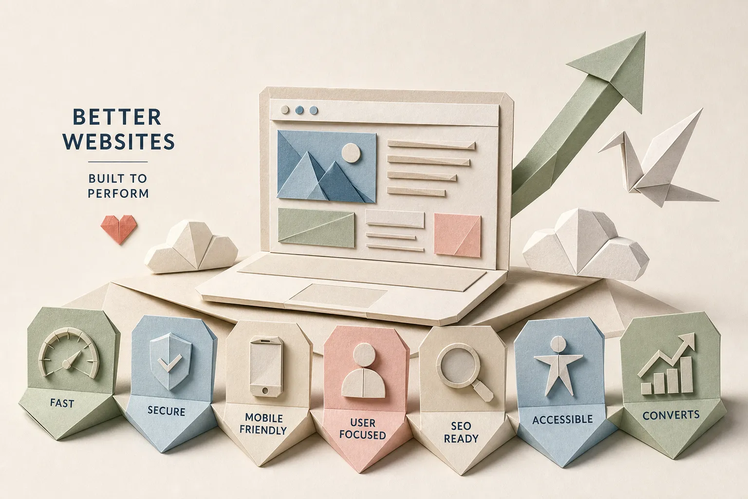
Two businesses in the same market. Similar offers, similar prices, similar target customers. One has a better website that pulls in steady inquiries every week. The other sits quiet, visited but unconvincing. The gap between them isn't luck, and it almost never comes down to budget. It comes down to a specific set of decisions made before a single font was chosen.
High-performing, better websites share a blueprint. The traits are consistent across industries, business sizes, and niches. Once you know what they are, you can audit your own site in under an hour and see exactly where the conversion leaks are hiding.
Trait 1: A Hero Section That Makes the Offer Immediately Obvious
Your hero section has one job: tell visitors who the site is for, what they get, and why it matters, before they have to scroll. Most sites fail this test by leading with brand-speak instead of outcomes. "Welcome to our company" communicates nothing. "Get more bookings from Google, starting this month" communicates a result. A clear headline, a one- or two-sentence supporting statement, and a visible CTA button are all your hero section needs to do its job well.
Trait 2: Visual Hierarchy That Moves Eyes Toward the Next Step
Visual hierarchy is the deliberate use of size, contrast, and placement to guide where a visitor's attention goes next. High-performing sites use hierarchy as a decision map, the headline draws the eye first, supporting context fills in the why, and the CTA closes the path. Removing competing links, promotional banners, and visual noise from above the fold consistently correlates with higher engagement, and it's one of the most dependable website design tips for improving UX of any size.
Trait 3: Mobile-First Performance That Meets Current Speed Benchmarks
Google's Core Web Vitals set the performance bar in plain terms. According to Google's Lighthouse documentation, for 2026, the passing thresholds are LCP at or under 2.5 seconds, INP at or under 200 milliseconds, and CLS at or under 0.1. Speed is a revenue issue: Vodafone improved their LCP by 31% and saw 8% more sales. NDTV halved their LCP and cut bounce rate by 50%. Tap targets need to be large enough to hit without zooming in, and font sizes need to be readable without pinching, and a large and growing share of small business website traffic now arrives on phones.
Trait 4: One Focused Primary Action Per Page With Intentional Language
One of the most reliable website conversion optimization improvements is eliminating competing actions. When a page offers five different things to click, visitors often click nothing. "Submit" performs worse than "Get a free quote." "Contact us" is weaker than "Book your strategy call." In documented tests across e-commerce and SaaS, CTA copy changes have produced conversion lifts, documented in A/B tests, in the 5–25% range.
Trait 5: Social Proof Positioned Near the Conversion Point
Testimonials and reviews don't do much when they're buried on a separate "Reviews" page that most visitors never find. They do their best work when they appear close to the CTA, because that's where hesitation peaks. A website rebuild for a concrete lifting company placed testimonials near the primary contact action and saw a 17% increase in calls within three weeks.
Trait 6: Authentic Imagery and Credibility Cues That Build Confidence Fast
Generic stock photography can weaken perceived authenticity. Visitors recognize it quickly, and it signals that the business may not be showing you who they actually are. Beyond photography, trust badges, security indicators, and partner or client logos all function as credibility shortcuts.
Trait 7: Clean Information Architecture With Fewer Decisions to Make
Simple, intuitive navigation uses clear labels, keeps the menu short, and makes sure every important page or conversion action is reachable in two clicks or fewer. Forms are the most underestimated conversion killer on most sites. The classic example: Expedia removed one field from their booking form and measured a $12 million increase in annual profit.
Your 7-Trait Audit
One yes/no question per trait: Can a first-time visitor tell within 5 seconds who this site is for? Does the page guide attention from headline to CTA without distractions? Does your site score 90 or above on Google Lighthouse? Does the site display correctly on a phone? Is there one clear primary CTA above the fold? Are testimonials visible near the CTA? Can a visitor reach any important page in two clicks or fewer?
If three or more of those answers are "no," treat it as a signal of structural problems rather than surface ones. Rewriting the CTA copy won't fix a slow mobile load time. Structural issues require a rebuild, not a patch.
The Bottom Line
The seven traits that separate high-performing sites from forgettable ones work together as a system: clear hero messaging, deliberate visual hierarchy, fast mobile-first performance, focused CTAs, social proof positioned near the conversion point, authentic trust-building content, and friction-free navigation. Better websites don't happen by accident. They're planned that way, from the first conversation, before the design ever begins.
Want this thinking applied to your business?
A free strategy call costs nothing and tells you exactly where you stand.