
Website Psychology · 9 min read
Outdated Website? 12 Signs It's Costing You Customers
An outdated website doesn't have to look broken to cost you customers. It just has to feel slightly wrong, and most visitors leave before reading a sentence.
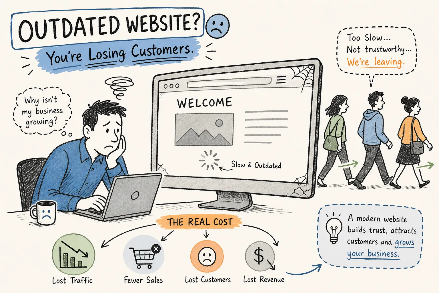
Pull up your own website right now. If something feels off, you're probably right. An outdated website doesn't have to look broken to cost you customers, it just has to feel slightly wrong, dated, or confusing, and most visitors will leave before reading a single sentence. At Better Website Co., we run site audits every week, and we see this pattern constantly: a business that delivers solid results but has a website quietly working against it. Run through the 12 signs below, note which ones apply to your site, and you'll have a clear picture of what to fix and how urgently.
Why an Outdated Website Costs You More Than You Realize
When someone lands on your website for the first time, they form an opinion within seconds, well before they've read your qualifications or scanned your years of experience. According to research published by Sweor, 88% of users won't return to a site after a bad experience, and "bad" doesn't always mean broken. It can mean dated, cluttered, or simply untrustworthy-looking.
This isn't just a design preference issue. According to data from Portent, modern well-designed sites can achieve conversion rates three to five times higher than outdated ones, though results vary by industry and page type. Every month your site stays stale is a month your competitors with better sites are capturing the customers who would have called you.
Design Signals That Reveal an Outdated Website at a Glance
1. A cluttered layout with no clear focal point. Spinning image sliders, multiple competing headlines, and three different things asking for attention above the fold are classic signals of outdated web design. Quick fix: simplify your hero section to one headline, one supporting sentence, and one clear button.
2. Fonts, colors, and stock photos that look stuck in time. Generic stock photos of people in suits shaking hands, inconsistent fonts across pages, and hard-to-read text over a busy background are immediate visual signals that the site hasn't been touched in years. Quick fix: replace your top-of-page image with something more authentic, and standardize your fonts to one clean pairing.
3. Weak or missing calls to action. Buttons buried halfway down the page, vague labels like "Click Here" or "Submit," and pages with no call to action at all are among the most common problems we find during site audits. Quick fix: rewrite your buttons to be action-specific, for example "Book a free call," and place at least one CTA above the fold on every key page.
How Mobile Experience and Page Speed Push Visitors Away
4. Your site fails the five-second phone test. Mobile devices account for roughly 45% of all web traffic in the United States as of 2026. If your site requires pinching, zooming, or sideways scrolling on a phone, you could be losing 50% to 70% of those mobile visitors the moment they arrive. Quick fix: open your site on your phone right now. If anything is hard to read or tap, that is the problem.
5. Pages take longer than three seconds to load. Pages that take more than three seconds to load see conversion rates drop sharply, with the steepest decline happening between the two-second and three-second mark. Quick fix: compress all images, remove plugins you're not actively using, and enable browser caching.
Content and Security Red Flags That Silently Destroy Trust
6. Stale content that makes your site feel abandoned. Old statistics from three years ago, outdated team photos, and blog posts last updated years back all signal neglect. Quick fix: audit your five most-visited pages and update any facts, offers, dates, or descriptions that no longer match your current business.
7. A "Not Secure" warning in the browser bar. If your site still runs on HTTP instead of HTTPS, every major browser is actively warning your visitors about it. Broken links and 404 error pages send the same message. Quick fix: confirm your SSL certificate is active and valid, then run your site through a free broken link checker.
8. No social proof anywhere visible. If your homepage and service pages have no testimonials, no reviews, and no case results, you're asking visitors to take a leap of faith that most won't take. Quick fix: add two to three short, specific client testimonials near your primary CTA on the homepage.
Navigation and Form Friction That Stops Real Inquiries
9. A navigation menu that buries what matters most. When your site has more than six or seven main navigation links, visitors experience decision fatigue before they even start reading. Quick fix: cut your main navigation to five items maximum and place "Contact" in the top-right corner.
10. Contact forms that ask for too much. According to data from HubSpot and Formstack, three to five form fields are the sweet spot for lead capture. Once you hit eight or more fields, many visitors abandon the form before submitting. Quick fix: reduce your form to name, email, and one specific question about what they need.
11. Your website doesn't show up on Google searches. Legacy websites are often built without keyword-relevant page titles, proper heading structure, or descriptive meta descriptions, all of which affect whether Google shows your pages at all. Try searching your top service plus your city name and see where you land.
12. You need a developer to make basic edits. If updating a service description or swapping a photo requires you to call a developer and wait days for a simple change, your CMS is operationally outdated. A website you can't control is a website that controls you.
Patches vs. a Full Rebuild
Several of the problems above don't require a full redesign at all. Compressing images, rewriting CTAs, activating your SSL certificate, simplifying your navigation, and reducing form fields can all be done in a day or two. These fixes deliver real improvement right away.
If your CMS makes basic edits painful, if your site's structure doesn't match how your buyers actually think and browse, or if your brand has evolved significantly since the site was built, surface-level fixes won't solve the underlying problem. For context, the average small business website redesign in the U.S. ran between $3,000 and $15,000 in 2026, compare that against the inquiries you're losing every month from a site that isn't converting.
A proper website modernization starts with strategy and buyer behavior, not design templates. It's mobile-first and fast-loading, structured for search from the ground up. That's exactly how Better Website Co. approaches every client redesign: we start with your business goals and your customers' decision-making process before we open a single design tool.
If your site scored poorly on more than a handful of these signals, you're likely leaving real revenue on the table every month. Most outdated websites don't fail because their owners stopped caring, they fail because buyer expectations, mobile standards, and design norms kept moving while the site stayed still. Use this article as your website redesign checklist: fix what you can quickly, and be honest about whether the deeper problems need a fresh start.
Want this thinking applied to your business?
A free strategy call costs nothing and tells you exactly where you stand.