Buying Guide · 9 min read
What Should Be on a Small Business Homepage?
The handful of things a homepage actually needs to do its job, and the clutter that gets in the way.
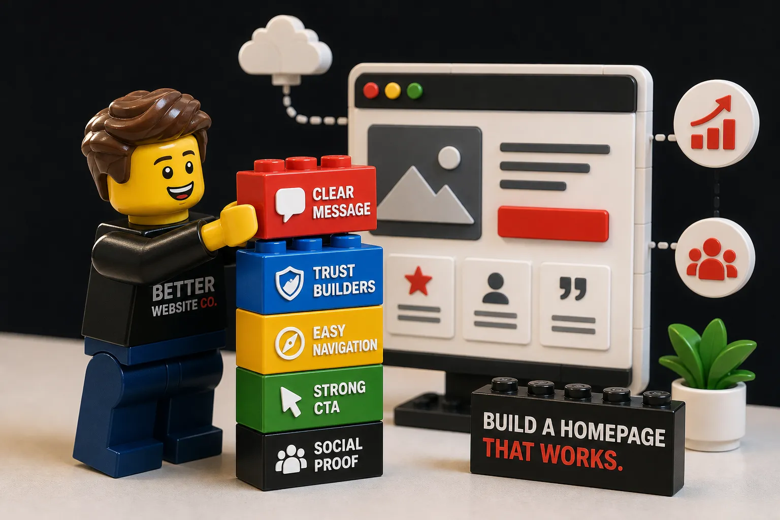
You paid for a website. You're getting traffic. And yet your phone isn't ringing, your inbox stays quiet, and you can't figure out why. The honest answer, more often than not, is the homepage itself. Not the color scheme. Not the font. The fundamental structure of how the page communicates what you do, who you serve, and what the visitor should do next.
We've spent years studying why some small business homepages convert visitors into inquiries while nearly identical-looking pages produce nothing. The difference almost always comes down to a specific set of elements working together. This walks through every one of them, with placement details and the psychology behind each, so you can build or rebuild a homepage that actually earns its keep.
The hero section: your first (and often only) chance to make a visitor stay
The hero section is the highest-leverage real estate on your entire website. Research consistently shows that roughly 55% of visitors leave a page within 15 seconds if they can't immediately understand what's being offered. Your hero section has one job: make a visitor feel, in under five seconds, that they're in the right place.
Three elements make or break a hero section: the headline, a short supporting line, and one primary call to action. The headline answers “what's in it for me,” the supporting line removes ambiguity about who you serve and how, and the CTA gives the visitor a clear, low-friction next step.
The ideal homepage headline sits between 6 and 10 words, is benefit-led, and speaks directly to the visitor's goal or pain point. “Welcome to our website” tells a visitor nothing. “Custom cabinetry for Portland homeowners, built to last” tells them exactly what you do, who it's for, and what the outcome is. A/B tests on benefit-led headlines consistently show conversion lifts of 10 to 20% over vague or clever alternatives. Cleverness feels good to write; clarity is what converts.
Your primary CTA belongs above the fold, in a high-contrast color, surrounded by enough white space to draw the eye naturally. The label should be 2 to 5 words and specific: “Book a free call” converts better than “Click here,” because it sets a clear expectation and removes hesitation. One dominant CTA above the fold consistently outperforms pages with multiple competing buttons — every extra option is a distraction from the decision you want the visitor to make.
The image or video in your hero section is doing more work than you might realize. Authentic photos of your team, your work, or the result you deliver outperform generic stock images in almost every test. Visitors are subconsciously evaluating whether this is a real, professional operation before they've consciously read a single word. A real photo of your finished renovation, your salon, or your team in action does that job. A stock image of a handshake does not.
Start with trust signals
First-time visitors have no prior relationship with your business. They arrive with healthy skepticism, and their first instinct is to look for proof that other people have trusted you and been satisfied. Trust signals serve one psychological function: they reduce the “risk feeling” that stops visitors from reaching out.
Think of your trust signals as a “trust stack” — a combination of elements that together reduce friction before the visitor commits to contacting you. No single element does the whole job, but the right combination, placed near the top of the page, creates a cumulative feeling of credibility. Testimonials placed near a primary CTA can increase conversion rates by an average of 34%, which makes placement as important as the content itself.
The type of trust signal that performs best depends on your business model. Star ratings and review counts are the strongest trust signal for most service and retail businesses, because they're immediately scannable and carry social weight. Named testimonials with specific outcomes work especially well for service businesses: “John helped us increase bookings by 40% in three months” is far more persuasive than “Great service!” Client logos and partner badges work quickly for B2B and consultancy-style businesses, because a recognizable brand name does the credibility work at a glance.
A services overview that moves visitors from curious to convinced
If a visitor can't quickly understand what you offer, they leave. The services section on your homepage isn't just descriptive copy — it's a decision-making aid. Its job is to give visitors enough information to know they're in the right place and enough clarity to want to learn more.
Write service descriptions in the language your customer uses, not your industry's terminology. “Residential roofing repair and replacement in under 5 days” is more compelling than “Roofing solutions.” The first answers real questions a homeowner has. The second answers nothing. Plain-language descriptions also help with SEO, because they match the words your customers actually type into Google.
Best practice is to keep the homepage services section to 3 to 5 service cards, each with a name, a short benefit statement, and a micro-CTA or link: “See how it works,” “View this service,” or “Get a quote.” This structure keeps the homepage as a guide rather than an encyclopedia, reduces decision fatigue, and creates a logical path through the site instead of a dead end.
Social proof that converts skeptics into serious inquiries
Social proof goes deeper than a trust badge or star rating. It's the specific, human evidence that someone like your visitor took a chance on your business and it paid off. People look to others' experiences to reduce uncertainty about their own decisions — when a visitor sees someone with a familiar problem and a documented positive outcome, they can picture themselves in that story.
A converting testimonial has three things: specificity, a named person with context, and an outcome. Collect these by reaching out to satisfied clients shortly after completing their project, when the result is fresh. Ask them what they were struggling with before working with you, what changed, and what they'd tell someone in their position. Display testimonials with the person's name, photo or initials, and their location or business if relevant — the more real it looks, the harder it works.
Placement matters as much as content. A review count or star rating near the top of the page establishes baseline credibility before the visitor has read anything else. A specific testimonial placed directly beside or just above the primary CTA reduces last-second hesitation right where the decision is being made — research on CTA-adjacent testimonials shows conversion lifts of 25 to 35% compared to the same proof buried in the footer.
Contact info and local details that help visitors (and Google) reach you
Contact information is both a conversion element and a local SEO signal, and most small business homepages underinvest in it. Every extra click or search a visitor has to do to find your phone number increases the chance they'll leave and call a competitor who made it easier. This is one of the most overlooked items on any small business website, and one of the highest-impact fixes you can make.
NAP stands for name, address, and phone number. Keeping these details consistent across your website, your Google Business Profile, and any directory listings is one of the most practical things you can do for local search rankings. When your address appears in five different formats across the web, Google loses confidence in which version is correct, and that uncertainty can pull you down in local results.
The standard layout that reduces friction the most: your phone number and a contact link in the header, your full address, hours, and email in the footer, and an embedded map or map link for physical-location businesses. Adding a short line like “We typically respond within 1 business day” near your contact form significantly reduces submission anxiety. For local SEO, implementing LocalBusiness schema markup with your NAP details, opening hours, and geo coordinates gives search engines a machine-readable version of the same information.
Mobile-friendly homepage features your visitors expect
A large share of small business website traffic arrives on smartphones, which means mobile-friendly homepage features aren't a bonus — they're a baseline requirement. Fast load times, tappable CTAs with enough spacing to avoid accidental clicks, readable headlines without pinching or zooming, and responsive images that don't slow the page down are all non-negotiable. If your homepage takes more than three seconds to load on a mobile connection, a significant portion of visitors will leave before seeing a single word of your content.
What a homepage built on these principles actually looks like
When all these elements work together, a homepage has a clear rhythm. The hero delivers immediate clarity and one action. Trust signals near the top reduce the risk feeling before the visitor has scrolled. The services section answers “what exactly do you offer?” and points toward deeper pages. Social proof placed throughout reduces hesitation at each decision point. Contact information is impossible to miss and frictionless to use. The page doesn't feel like a brochure — it feels like a guide leading the visitor toward one obvious next step.
A quick self-audit for your current homepage
Run through these six checks right now. Is your headline benefit-led and immediately clear to someone who has never heard of your business? Is there one primary CTA above the fold with no competing buttons? Are trust signals visible without scrolling? Is your services section written in plain language your customers actually use? Is social proof specific, named, and placed near your conversion points? Is your contact information in both the header and the footer? Fix the weakest point first — in most cases, that's the headline, because everything else on the page inherits its power from getting that one thing right.
Your homepage has one job: answer three questions fast
A homepage that converts isn't impressive because of how it looks. It's effective because it answers three questions before a visitor has a chance to doubt themselves: what do you do, why does it matter, and why should I trust you right now? Every element covered here serves one of those three questions — none of them are optional if converting visitors into inquiries is your goal.
Start with the hero section if you make no other changes today. It's the highest-leverage real estate on the page, and getting the headline and CTA right will have a measurable impact on everything that follows. Once that's solid, work down the page: trust signals, services, social proof, contact details. If you'd like a second set of eyes on your current homepage, our free Online Presence Audit looks at exactly these elements and tells you what's working, what's missing, and where the biggest conversion opportunity is.
Want this thinking applied to your business?
A free strategy call costs nothing and tells you exactly where you stand.