Booking Experience + Conversion Design
Designing a single-property listing around how someone actually decides to book
Isimi Haven
The Challenge
The existing page had the surface of a premium listing but not the substance. The Check In / Check Out / Guests bar near the top looked like a real booking tool and wasn't: it was styled text with no function behind it. Beyond that one broken component, the page had no real plan for trust: the obvious move for a new short-let listing is star ratings and guest quotes, and none of that existed yet for Isimi Haven. Shipping fabricated reviews would have solved the trust problem on the page while creating a worse one the moment a guest checked Airbnb or Google and found nothing to match.
Overview
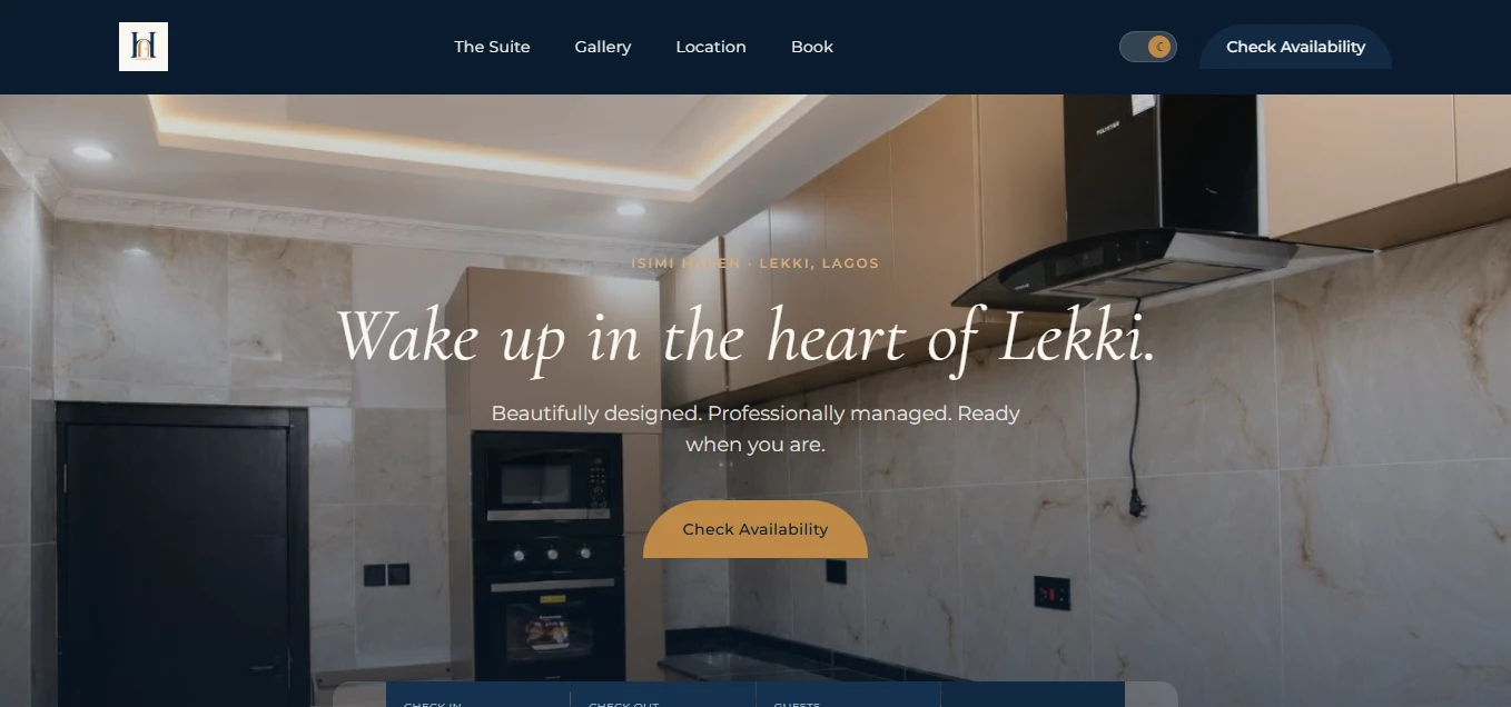
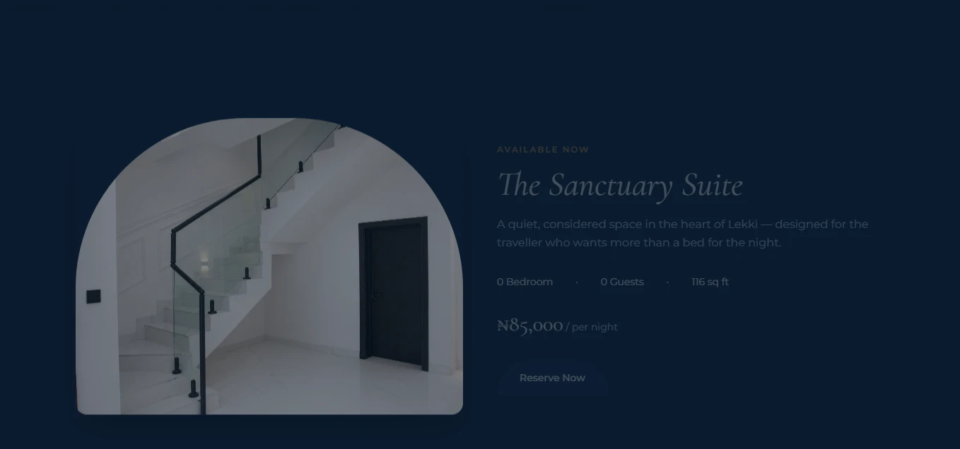
Isimi Haven is a single short-let apartment in Lekki, Lagos: The Sanctuary Suite, 650 square feet, one bedroom, two guests, ₦85,000 a night. The brief was a booking page for one property, competing for attention against every polished Airbnb listing a guest has already scrolled past. The objective wasn't more content. It was a page that answered every hesitation a guest would have, in the order they'd actually have it, and worked exactly the way it looked like it should.
Discovery
The starting question wasn't "what should this page look like." It was "what does someone need to know, in what order, before they'll hand over a deposit for an apartment they've never seen in person." Booking a short-let follows a fairly predictable sequence: orient in a few seconds, check proximity to the things that matter, look closely enough at the space to picture staying there, look for a reason to trust the host, understand exactly what's included, and understand what happens immediately after paying.
Auditing the existing page against that sequence surfaced two real problems, not just cosmetic ones. First, the non-functional booking bar: a visitor's first real interaction with the page was clicking something that did nothing, which undermines trust in everything that follows it, independent of how good the rest of the page looks. Second, a trust gap with no honest way to close it yet: no guest reviews exist for Isimi Haven at this stage, so the conventional fix (testimonials, star ratings) wasn't available without inventing something.
The conversion opportunity wasn't a new section or a new feature. It was reordering and rebuilding what already existed so that scrolling down the page tracked a guest's actual thinking, and removing every element that looked interactive but wasn't.
Strategy
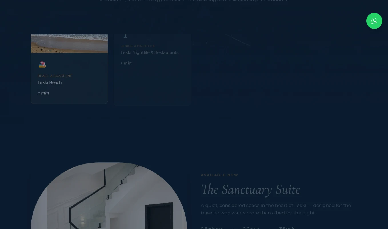
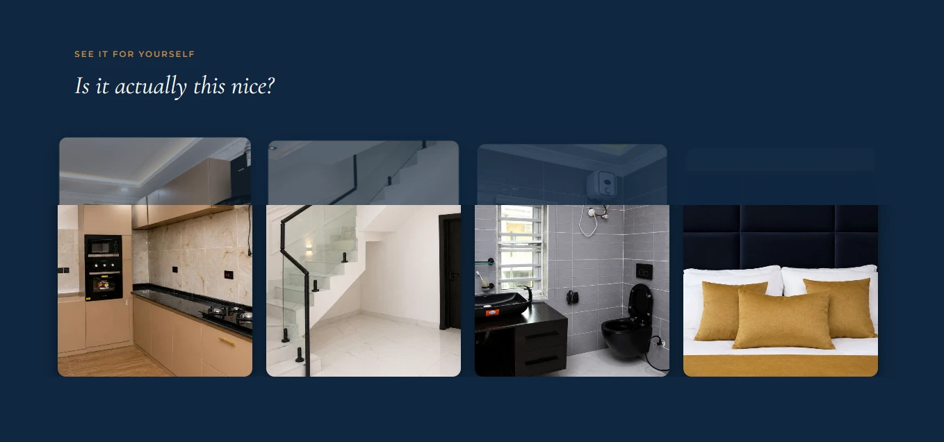
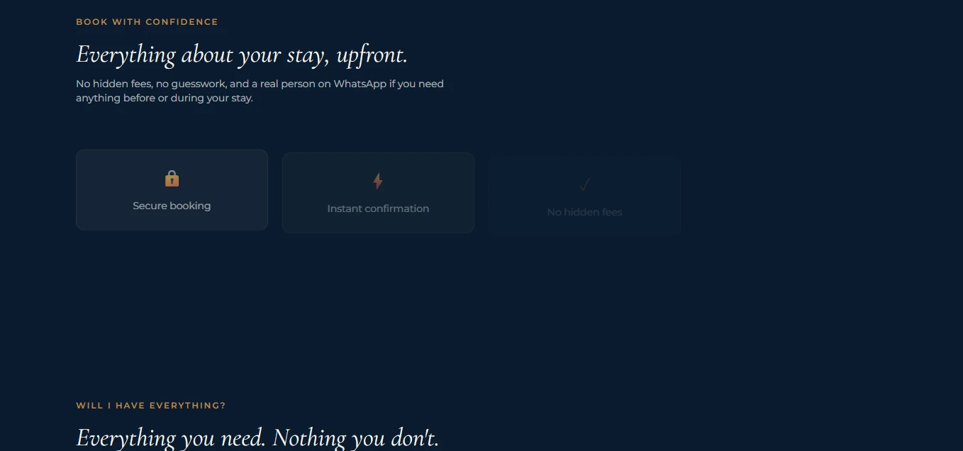
Two decisions shaped everything downstream. The first: clarity before decoration. Every section earns its place by answering one specific question, in order: hero for orientation, location for proximity, the apartment itself for specifics, gallery for scrutiny, a trust section, amenities framed as outcomes rather than a feature list, then a plain explanation of what happens after booking. Nothing was added because a listing page is "supposed to" have it.
The second: reduce decision friction instead of adding persuasion. The old "Search" label on the booking bar was replaced with "Book Now," a small change, but one that reflects a broader shift from generic booking-site language to language that matches what the visitor is actually about to do. The same logic applies to the trust section: instead of manufacturing testimonials, it makes visible the guarantees that are true right now: secure payment, no hidden fees, 24-hour security, a real person on WhatsApp. Claims that hold up if a guest checks them, because none of them are exaggerated.
This is where "Book With Confidence" replaced what would conventionally be called a "Trust" or "Reviews" section. The rename reflects the actual content: verifiable guarantees a guest can act on today, explicitly built to be replaced by real reviews the moment they exist, not a permanent workaround.
Design
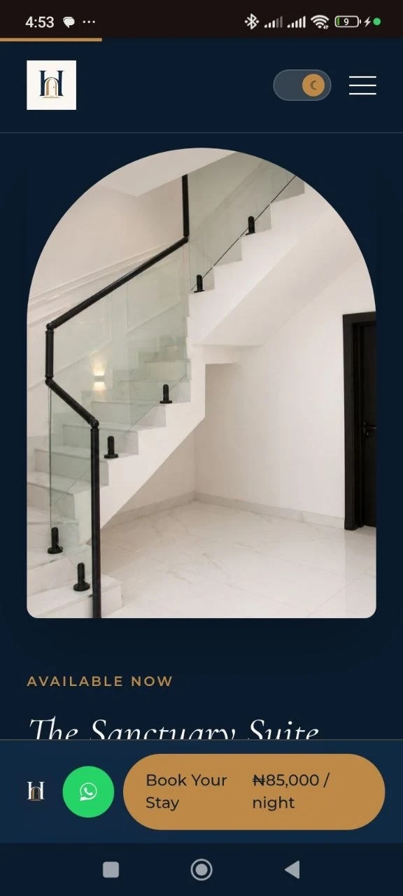
The palette (navy, gold, cream) comes directly from the Isimi Haven logo rather than being chosen separately and reconciled with it afterward. The logo's doorway shape recurs around the main photo and around CTAs, so the brand identity is woven through the page instead of sitting only in the header. A light, reversed version of the logo was built specifically so it holds up cleanly on dark backgrounds, since the original mark wasn't built with that use case in mind.
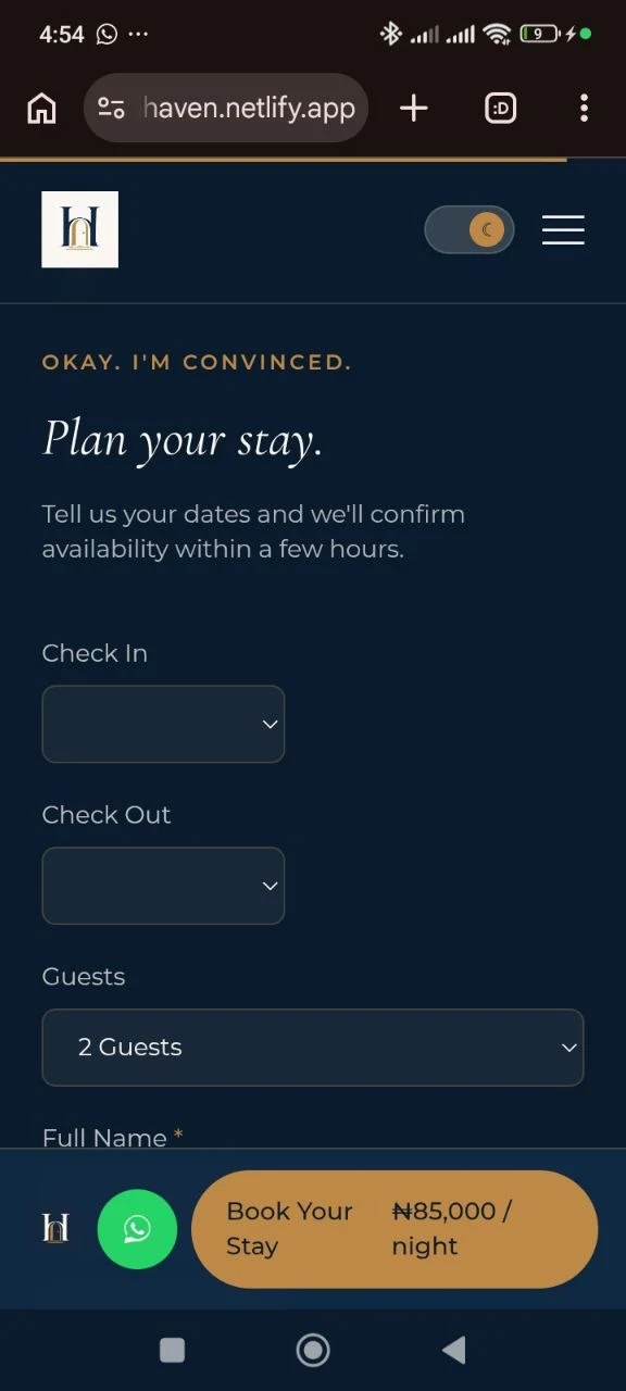
Every layout decision assumed a phone screen first, not a compromise made afterward. Most traffic to a page like this arrives from a WhatsApp message or an Instagram bio link, on a phone, so a persistent bottom bar on mobile keeps a WhatsApp button and a "Book Your Stay" button visible no matter how far down the page someone has scrolled. The booking path is never more than a thumb-reach away, at any point in the read.
Concrete specifics were treated as a design element, not just copy: the featured apartment section states 650 sq ft, one bed, two guests, ₦85,000/night, framed inside the arch motif, so a guest can self-qualify in seconds rather than inferring fit from adjectives.
Motion
The hero runs on an AI-generated background video rather than a static photo, underlaid behind the headline and availability widget. Its job is atmosphere, not attention. It sets a sense of place in the first second without competing with the headline, the availability widget, or the primary CTA for focus. Every other motion decision follows the same rule: support the booking path, or don't ship it.
The headline reveals word by word instead of appearing all at once, so the first moment on the page reads as deliberate rather than templated. The primary gold CTAs have a subtle magnetic pull toward the cursor on hover, a small, expensive-feeling detail that costs nothing functionally but signals the same care as the rest of the build. Gallery photos zoom slightly and reveal the room name on hover, so browsing feels closer to a native app than a static page.
Numbers that matter to the booking decision (bedrooms, guest count, travel times) count upward on scroll instead of appearing instantly, which draws the eye to information a guest actually needs to decide. The four-step "Your Stay, Simplified" process is connected by a gold line that draws itself in as the section scrolls into view, visually reinforcing that booking here is a short, clear sequence. On successful submission, a checkmark draws itself in rather than a static success message, a small, earned moment of reassurance placed exactly where a guest needs it: right after they've committed.
Outcome
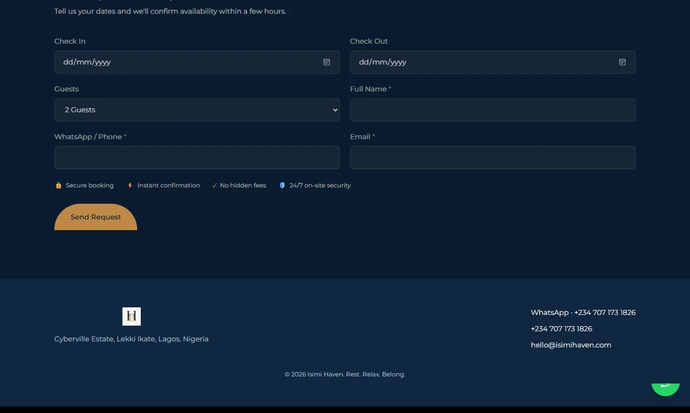
The booking flow is functionally complete end to end: a working availability widget that carries real dates and guest count into the form, a booking form connected to real deposit payments through Paystack, and automatic email confirmation through Resend, all built and tested, not mocked up. The page a guest lands on now matches what it appears to promise at every step, including the one that used to be broken.
Trust on the page is built entirely from claims that are true today rather than ones borrowed from a template. The "Book With Confidence" section is explicitly scoped as temporary, designed to be replaced by real guest reviews the moment they exist, rather than treated as a permanent stand-in for social proof.
The one item outside the design and build work itself: the client has not yet purchased a domain, which is what's currently holding back guest-facing emails and live payments going out under a permanent address. Everything the build controls is finished.
Reflection
The strongest decision on this project was a restraint, not an addition: not fabricating reviews. It would have been the fastest way to make the page look more trustworthy in a screenshot, and the fastest way to lose that trust completely the moment a real guest checked and found nothing to match it. Building confidence from claims that are true today, instead, meant slower-feeling trust-building work up front. But nothing on the page can be caught out as fake, because none of it is.
This project reinforced a broader pattern in this kind of work: a page earns trust by sequencing itself around a real decision, not by decorating a generic template. The booking widget mattered more than any animation on the page: a single broken interactive element undoes far more credibility than a missing star rating ever could. Design work here isn't the visual layer on top of a business decision. It's the mechanism that decision runs through.
Why This Works
Every section answers the next question a real guest is already asking, in order
A booking widget that actually works, from the first scroll
No fabricated reviews: trust built on claims that hold up under scrutiny
Colour and shape pulled directly from the brand mark, not picked separately
Built mobile-first for a guest arriving from a WhatsApp or Instagram link
Motion used only where it removes a moment of doubt, never for its own sake
Live Walkthrough
Live scroll-through, isimihaven.netlify.app
In Practice
Works On Mobile Too
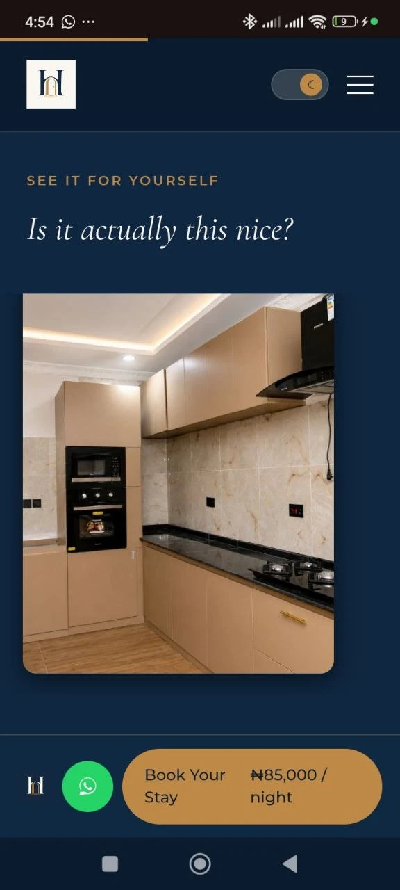
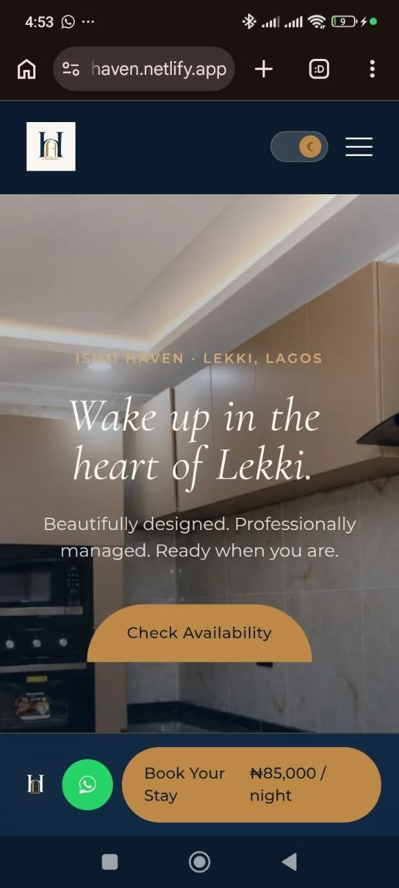
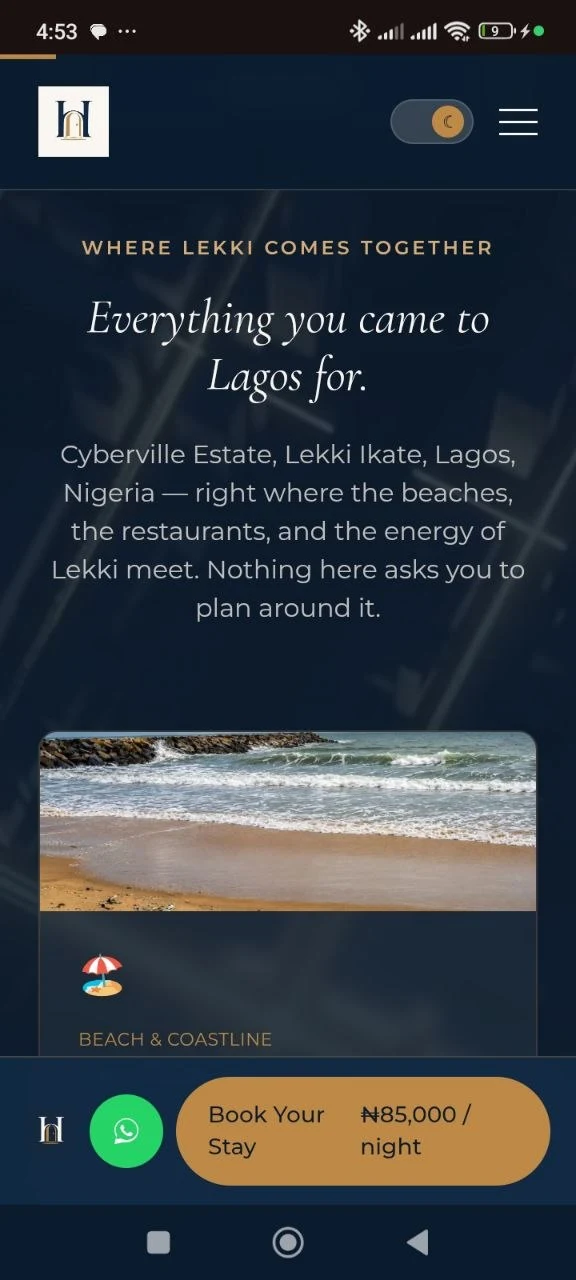
Brand Applications
What Changed?
Before
- Booking bar at the top of the page looked interactive but didn't respond to input.
- Trust relied on generic listing conventions with no real plan for social proof.
- Travel times and specs shown as flat static text with no hierarchy.
- No consistent link between the brand mark and the rest of the site.
After
- A working availability widget that carries real dates and guest count into the booking form.
- Trust built entirely on claims that are true today: secure payment, transparent pricing, 24/7 security, a real person on WhatsApp.
- A booking form connected to real deposit payments and automatic email confirmation.
- A site a guest would recognize as one brand, from the first photo to the final confirmation.
A booking page doesn't earn trust by adding reviews it doesn't have yet. It earns trust by being honest about what's true today, and working exactly the way it looks like it should, everywhere a guest actually clicks.
View live site ↗Want something like this for your business?
See Services