Positioning + Conversion Strategy + Full-Stack Build
Rebuilding my own studio's site into the case study it should have been all along
Better Website Co.
The Challenge
Three real problems, not cosmetic ones. First, positioning: the site read as "another agency that makes pretty websites," when the actual differentiator is strategic and psychological thinking about why people trust a business, not just visual polish. Second, no conversion hierarchy: several calls to action (a homepage concept, a website audit, a generic inquiry form) competed for the same click with no primary path, which is a worse outcome than picking one and committing to it. Third, one audience problem hiding inside a single page: a hiring manager evaluating my work and a business owner ready to pay for a website are asking completely different questions in the first five seconds, and the original page answered neither particularly well by trying to answer both at once.
Overview
This is the studio site behind every other case study on this page — and for a long time, it was the weakest-built one of all of them. It carried the same premium visual language as the client work, but the underlying structure was still a fairly conventional agency page: services, pricing, a contact form, and several competing calls to action with no clear hierarchy. Because this site does two jobs at once — winning new client work and serving as the portfolio I hand straight to a hiring manager — neither job was being done as well as it could be. This case study documents the ongoing work to fix that, end to end: positioning, information architecture, a real conversion funnel, and the technical plumbing (analytics, ad tracking, booking) underneath it.
Positioning
The repositioning started from a specific line of thinking: the website is the medium, but strategic thinking is the product. That meant the copy needed to stop leading with "we build websites" and start showing the reasoning behind the work — why people trust a business, what makes them hesitate, how a website can move that decision. Generic agency language ("digital solutions," "innovative experiences," "results-driven") never made it onto the page in the first place, which made this pass mostly about making the existing strategic thinking visible rather than removing anything.
This showed up concretely in the "Beyond Code" section, which now states plainly: not another agency making pretty websites. The rest of that section (six specific trust-and-conversion reasons, the founder story) already did the "how I think" work well, so the fix here was one honest positioning line, not a rewrite.
Conversion Strategy
The core decision was picking one primary conversion action and committing to it: a free strategy call, not a generic "get in touch." The existing offers (a free homepage concept, a free website audit) didn't get deleted — they got demoted to secondary paths, still available for a visitor who isn't ready to book a call, but no longer competing visually or narratively with the main ask. That distinction (demote, don't delete) mattered: removing a working offer outright would have been the easy move and the wrong one.
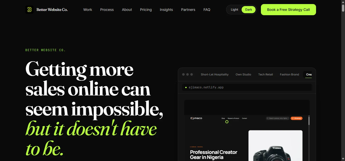
The hero, navigation, and closing section all now lead with "Book a Free Strategy Call," styled as the clearly dominant action everywhere it appears, with "See the Work" as the deliberately secondary path for a visitor who wants proof before they'll commit to a call. The inquiry form's own copy was rewritten to match: it now honestly presents itself as the fallback for someone not ready to book, instead of duplicating the strategy-call promise on-page.
The call itself is framed as a real diagnostic conversation, not a disguised sales pitch: 30 minutes, no pitch, look at what's creating friction or weakening trust on a visitor's own site, and talk through the biggest opportunities. The prospect should get something useful even if they never hire me.
Information Architecture
Rather than a single page trying to serve two different visitors, a lightweight, non-modal fork appears right after the hero: "I need a website that converts" versus "I'm reviewing your work." No popup, no forced choice — a visitor who ignores it just keeps scrolling the default order. Choosing a path reorders what follows: a recruiter sees case studies, process, and a dedicated Recruiter Toolkit section first, with the sales machinery (pricing, growth plans) pushed below the fold instead of removed; a prospective client sees proof, then positioning, then process, then the pricing and booking path, in the order those questions actually get asked.
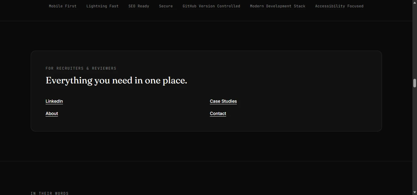
The Recruiter Toolkit itself is a small, deliberately restrained "resource shelf": case studies, about, contact, and an embedded LinkedIn profile badge, styled to match the rest of the site rather than reading as a stack of download links bolted onto the bottom of the page.
Build & Architecture
The technical foundation: React + Vite + Tailwind + Framer Motion, same stack as every other project on this site. What's specific to this build is the rendering pipeline — every route is server-side rendered and prerendered into real, static HTML at build time, so a route landed on directly from a paid ad or a search result serves actual content immediately, not an empty div waiting for JavaScript to hydrate. Anything placed in the shared HTML template (a tracking script, a meta tag) automatically propagates to every one of the site's twenty-five-plus routes through that same pipeline, which is what made the analytics work below possible to do correctly in one place instead of duplicated per page.
The whole rebuild ran as a long series of small, scoped checkpoints rather than one large rewrite: each change built, verified, and packaged on its own before the next one started, with a written handoff for every step covering exactly what changed, why, and what was deliberately left alone. That discipline is what kept a genuinely large scope of work (positioning, IA, conversion strategy, two ad platforms' tracking, and a booking integration) from turning into an unreviewable pile of changes.
Analytics & Ad Tracking
The site already ran a TikTok Pixel with custom conversion events for viewing a case study, clicking a primary CTA, and a successful form submission. Adding LinkedIn's Insight Tag meant it had to sit alongside that setup without duplicating, breaking, or double-firing anything already working — the two pixels now load from the same static template, independently, each verified to appear exactly once per page in the actual built HTML, not just in source.
A real technical judgment call came up here: LinkedIn's no-code conversion tracking can only detect a distinct URL being visited. A same-page anchor click or an in-place form success state is invisible to it. Rather than reaching for Google Tag Manager (explicitly ruled out) or writing tracking code where it wasn't needed, the two problems got two different, correctly-matched solutions: a plain no-code URL-match rule for the strategy-call CTA (once it linked out to a real, distinct booking URL — see below), and a small, isolated, clearly-documented custom event module for anything that genuinely couldn't be captured that way. No personal or form data is ever sent to either ad platform, only the fact that a conversion happened.
Booking Integration
The final piece was making "Book a Free Strategy Call" actually book a call, not scroll to a contact form. Rather than building a custom booking system, the CTA now links directly to a Calendly page, opened in a new tab. The decision to use a plain link instead of Calendly's own embeddable widget was deliberate: a widget means loading a third-party script on every page just to open a scheduler, which runs against the same "no unnecessary libraries" principle that ruled out Google Tag Manager for the tracking work. A link achieves the same outcome — a visitor picks a real available time — with nothing extra shipped to the browser.
This also happened to solve the LinkedIn tracking problem cleanly: once the CTA opened a real, distinct URL, LinkedIn's no-code page-load conversion rule could detect it directly, no custom event code required for that specific conversion.
Outcome
The site now has one clear primary conversion path end to end: a strategy call that's actually bookable, positioned honestly as a diagnostic conversation rather than a disguised pitch, with the previous offers kept alive as secondary options instead of deleted. It has a working, non-intrusive way to serve a recruiter and a prospective client differently without either one hitting a dead end. And it has two ad platforms' tracking installed correctly, independently, and verifiably, with the technical reasoning for every custom piece of tracking code documented rather than just shipped.
This is also, deliberately, the most transparent case study on the site about how the work actually got done: I own every strategic call, every architecture decision, and every review pass here — positioning, conversion hierarchy, what to demote versus delete, which tracking method fit which problem, what to build custom versus what a no-code tool already handled correctly. I use AI-assisted development the way any operator uses leverage: to execute faster on decisions I've already made, not to replace making them. The checkpoint history behind this page is a fuller record of that judgment than a finished screenshot on its own could ever show.
Reflection
The most consequential decision in this whole process wasn't a design choice — it was refusing to delete a working offer just because it was no longer the primary one. Demoting instead of deleting the homepage-concept and audit offers meant more restraint up front (reframing copy, deciding hierarchy, checking nothing orphaned) for a better outcome: no visitor who preferred the old path hits a dead end, and the new primary path still gets to be unambiguous.
The second-most consequential one was matching each tracking problem to the simplest correct solution instead of one default approach for both: a no-code rule where a no-code rule could genuinely do the job, and custom code only where it couldn't, explained before it was written. That's the same underlying discipline as every other case study on this site — the mechanism should match the actual shape of the problem, not the easiest thing to reach for.
Why This Works
One unambiguous primary CTA (a real, bookable strategy call), with prior offers demoted, not deleted
A non-modal fork that serves recruiters and prospective clients differently, no forced choice
Positioning that shows the strategic reasoning behind the work, not just the visual output
Two ad platforms' tracking installed independently, verified to fire exactly once per page
Every custom tracking event justified in writing before it was written, not by default
A booking link, not a booking widget: the outcome without the extra script
Live Walkthrough
Homepage walkthrough
In Practice
Works On Mobile Too
Brand Applications
What Changed?
Before
- Read as a standard web-design-agency page with no clear differentiation.
- Several competing calls to action (homepage concept, audit, generic contact) with no primary path.
- One page trying to serve both a hiring manager and a paying client equally, and doing neither especially well.
- No ad-platform conversion tracking beyond a single pixel with a handful of custom events.
After
- One clear primary conversion: a free strategy call, positioned as a diagnostic conversation, actually bookable via Calendly.
- A non-intrusive fork that shows recruiters and prospective clients the version of the site built for them.
- Positioning copy that states plainly what makes the work different, not just that it looks good.
- TikTok and LinkedIn tracking both installed correctly, verified independently, with no duplicated or fabricated events.
This site is the clearest evidence of how I actually work: own the strategy, own the architecture, own every review pass — and use AI-assisted development as leverage to execute those decisions faster, not as a replacement for making them.
View live site ↗Want something like this for your business?
See Services